EVBox
Rebranded platform for a seamless B2B and B2C experience
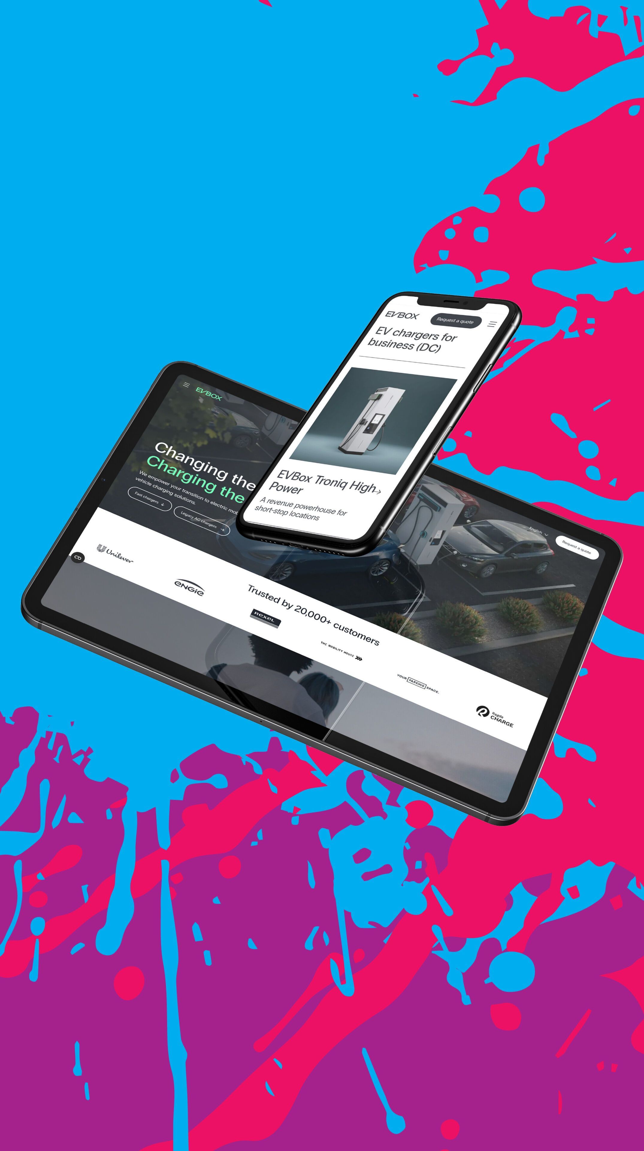
EVBox, a pioneer in electric charging solutions, underwent a complete rebrand after a decade to reflect their evolution and vision for the future.
We created a powerful digital platform for EVBox, enabling both consumers and businesses to effortlessly find their perfect charging solution.
Discover the platform at www.evbox.com
About EVBox
EVBox has been a leader in the world of charging solutions for more than a decade. With smart charging stations, advanced software and a strong international network, they help companies and governments switch to electric transport. Demand for scalable charging infrastructure is growing, and EVBox needs to be able to move quickly.
To support EVBox in their growth, we developed a powerful and modular platform that effortlessly keeps up with their global ambitions.
Find the product you need
in no time
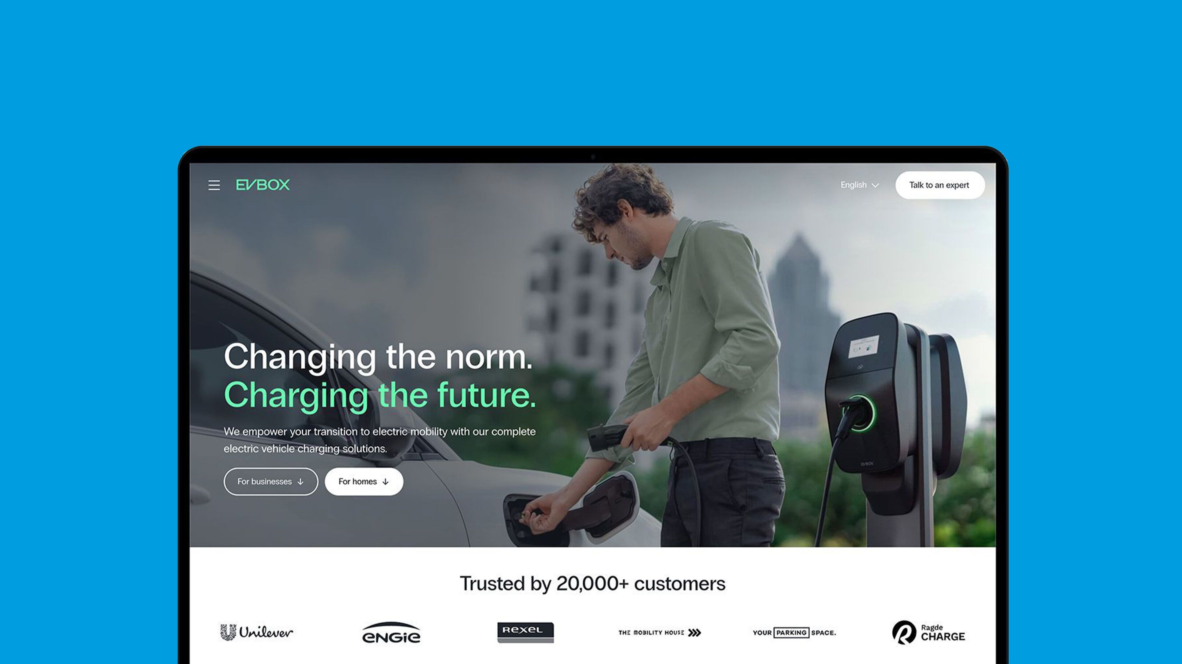
We optimized the user experience by tailoring the website to EVBox's two target groups: individuals and businesses.
Visitors choose directly what they need a charging station for and immediately see relevant information and products. Thanks to 3D animations, they discover every detail, configure their ideal model and easily request a quote.
Optimal content management
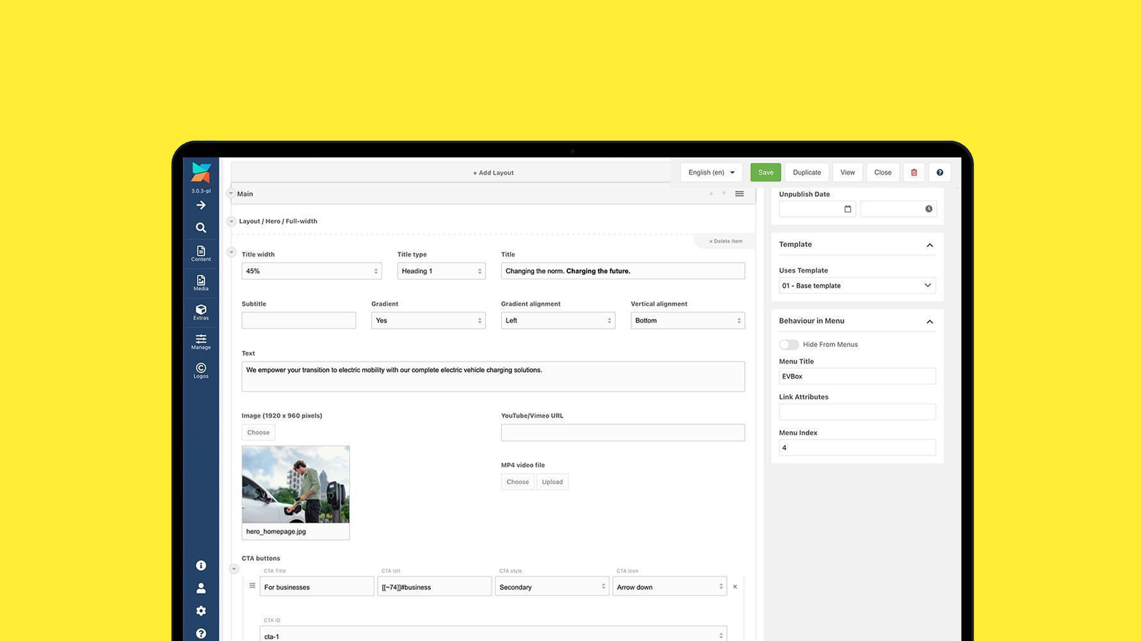
We also tackled and optimized the CMS with a smart, flexible content structure. Variable content blocks allow EVBox's content managers to easily customize the style of a page – from alignment and background color to color transitions. This reduced the number of blocks from 40+ to 26, ensuring less code and less maintenance.


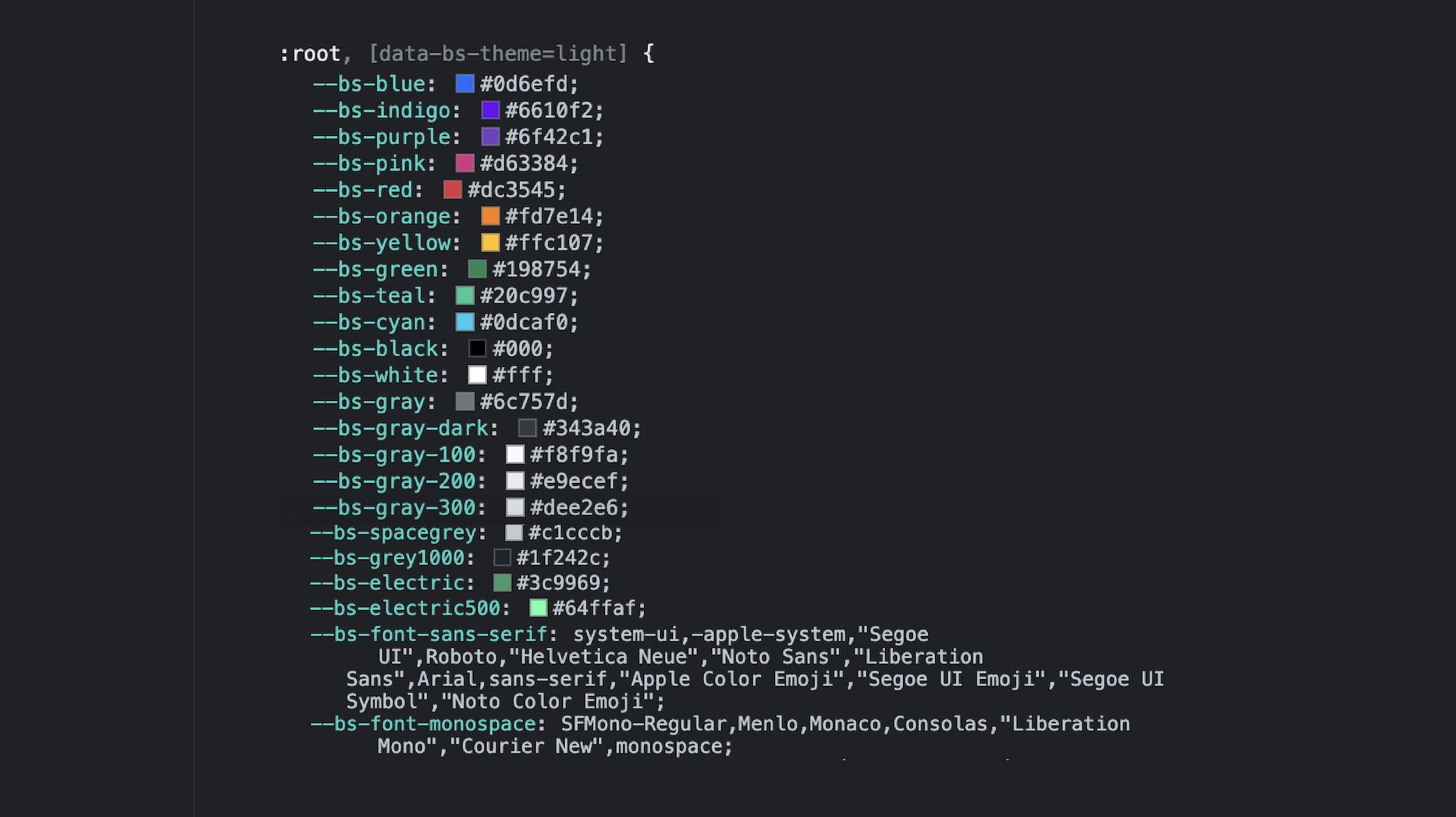
Consistent design, easy management
With design tokens and Figma, the EVBox design remains consistent across all platforms. Changes to colors, icons, fonts or spacing are made centrally in Figma and automatically applied to the website. One change, up-to-date everywhere.
Smart integrations for HR and marketing
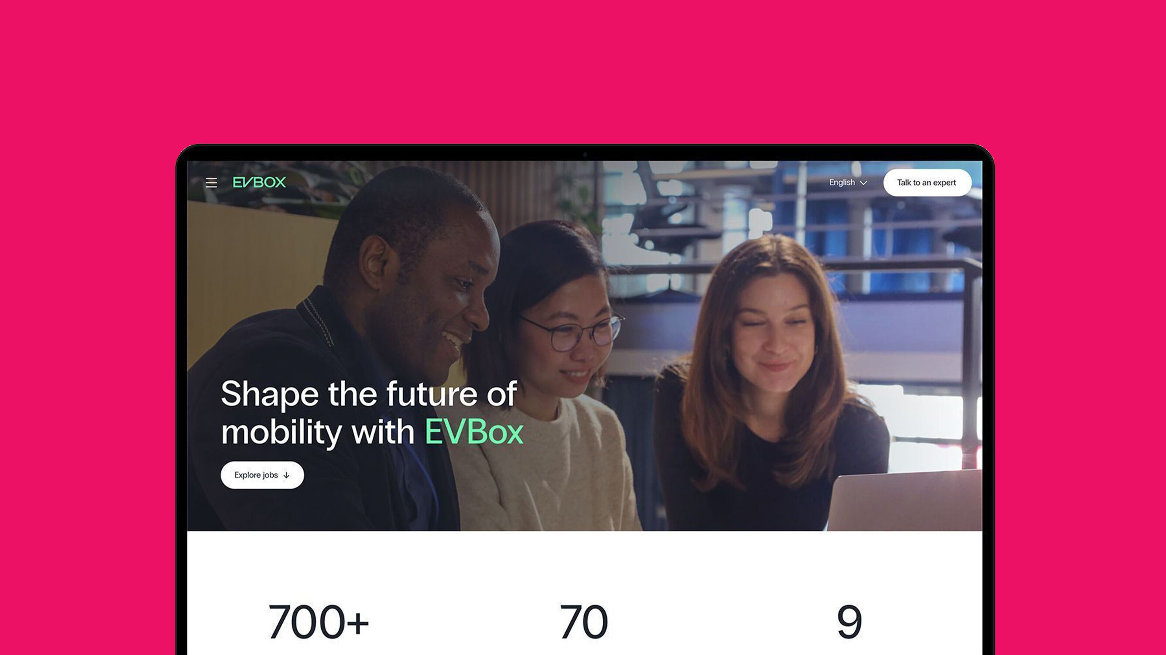
EVBox's new platform integrates seamlessly with Greenhouse and HubSpot. Vacancies and job applications are automatically synchronized, while HubSpot provides targeted lead generation and customer insights. One system, full control.
Strong cooperation
Smooth process
For a website that perfectly matches EVBox's new identity, we worked with product managers, content editors, designers and developers from EVBox, Sterc and external partners.
With SCRUM and two-week sprints, we kept the project tightly organized. Designers presented the vision, developers took care of the technical implementation, and refinement and retrospective meetings kept everyone sharp and focused on the end result.
Ready for a redesign?
Schedule a meeting with Bas!


